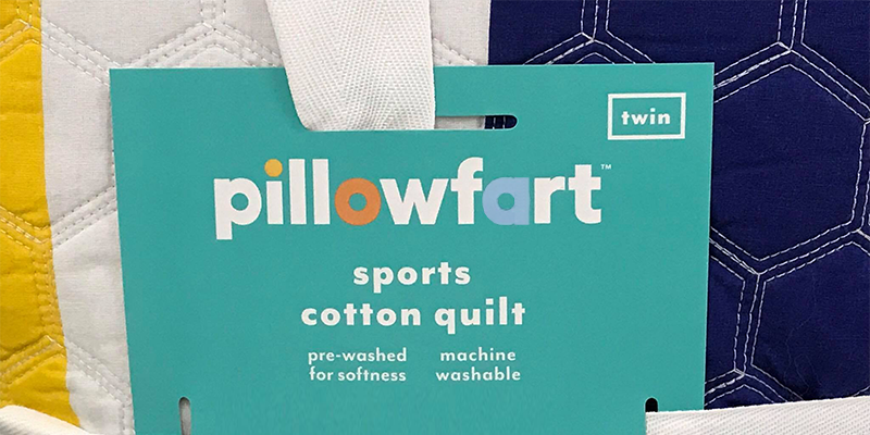
So I’m in Target walking through the home furnishing department and wander down the kids’ bedroom aisle and this label catches my eye.

Do you see it?
In an informal group on Facebook, I posted the original picture. All respondents, admittedly a small sample with a skewed sense of humor like mine, reported reading the label the same way I did.

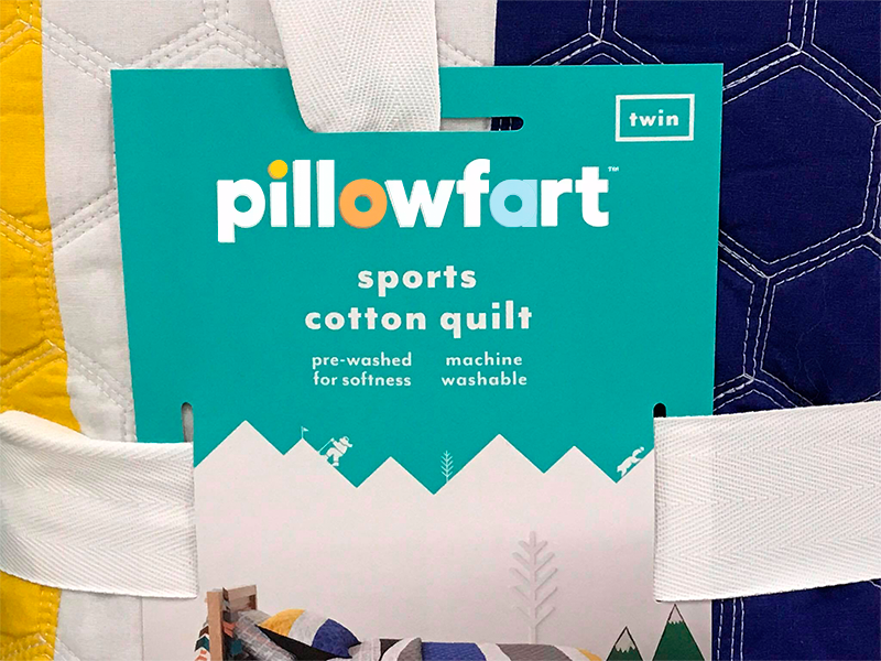
I’d love to make up a whole bunch of “a” stickers and put them on the Pillowfort merchandise so people like me wouldn’t have to look twice to see if it says what it looks like it says.
Not entirely inappropriate for children’s bedding. Maybe it really is supposed to say that.